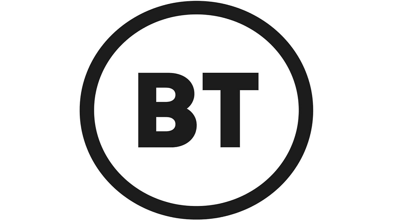
Earlier this week my sister sent me an article by the Guardian talking about BT’s latest rebrand. The rebrand is subject to years of work but what do we think of it?
Marketing campaigns can often involve a lot of risk for a brand, especially when trying to make a statement. Rebranding, however, can be even riskier with the brand changing its whole look. So when a well-known brand like BT decides to change its look up a bit quite a few of us will have something to say.
BT has changed its look a few times in the past, as you can see from the above. You may recognise these past logos and I think we can all agree each was an improvement on the last. The latest addition is a little more questionable though as it really goes back to basics.
Over the years you will have seen many brands give their looks a little shake-up. Some do this really successfully others have us really questioning their intentions, like BT. One that probably comes to all of our minds is the evolution of the Apple logo. The first logo we can see is quite overcomplicated for a logo but they soon simplified to the simple apple design only changing the colour thereon. This is a logo no matter what colour it really has that we will always recognise.
For every logo rebrand that has been done well though, there are rebrands that just don’t stick. Many of us may have forgotten about Royal Mail’s rebrand ultimately because it didn’t stay. Am I the only one that doesn’t remember this? The change makes the brand unrecognisable which would have caused customers a lot of confusion. Switching back was defiantly the best choice they could have made in this case.

Verdict
Personally, I don’t believe this new logo for BT is going to work. Going back to basics here isn’t the best idea. They’ve lost their signature blue, although the shades changed blue has always been in their logo. This loss of colour feels like a loss of life for the brand. The new logo just feels very simple and thoughtless to me not something I can imagine anyone wanting to use to represent their brand. We shall just have to see if BT stick with this one.
I hope you have enjoyed my brief look into BT’s rebranding. As always, I would love to see your comments below and I’m always up for a discussion on any of my blog topics if you want to drop me a message via LinkedIn or Instagram. What’s your favourite rebrand?
Featured image courtesy of Gizmodo UK.


2 Comments
Add Yours →That first Apply logo has just blown my mind with how different it is to the logo we know and recognise today! I didn’t even know the company had been going since 1976! Great post 🙂
Thanks, glad you liked it! Yeah the Apple logo sure has changed a fair bit just shows the progression in design over the years too.